Everything looks new and fresh in the iOS 7 beta. Here are some screenshots to show how the new UI and design looks!
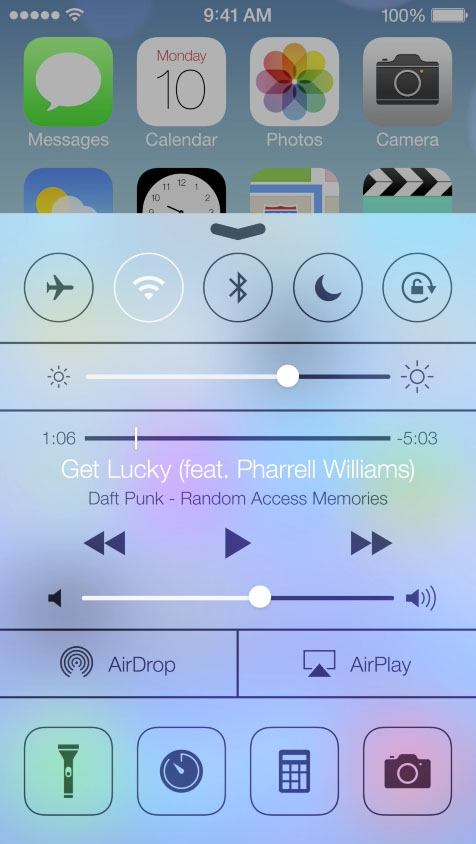
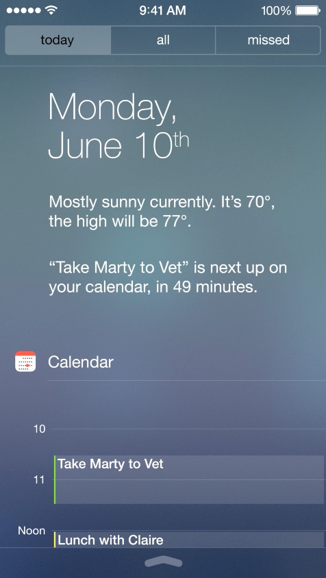
Starting with the homescreen, the signal bars are replaced with circles. Also apparent is the more modern looking font and flat icons.Swipe up from the bottom of the screen and you have quick settings (something I had on my jailbroken iPhone 3GS in 2010) Finally!
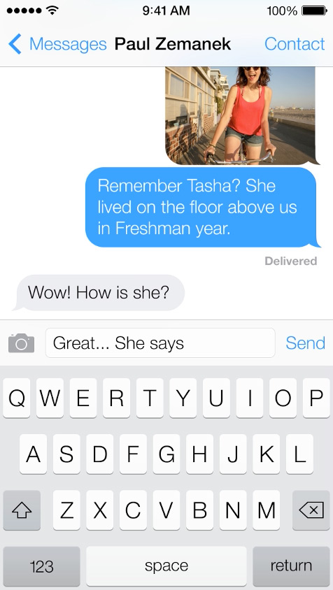
 The messages app for iOS 7 looks beautiful and modern with a fluid like interface for scrolling.
The weather app is just like Yahoo’s weather app for iOS, but with different backgrounds. This isn’t a bad thing as yahoo’s app is one of the best weather apps.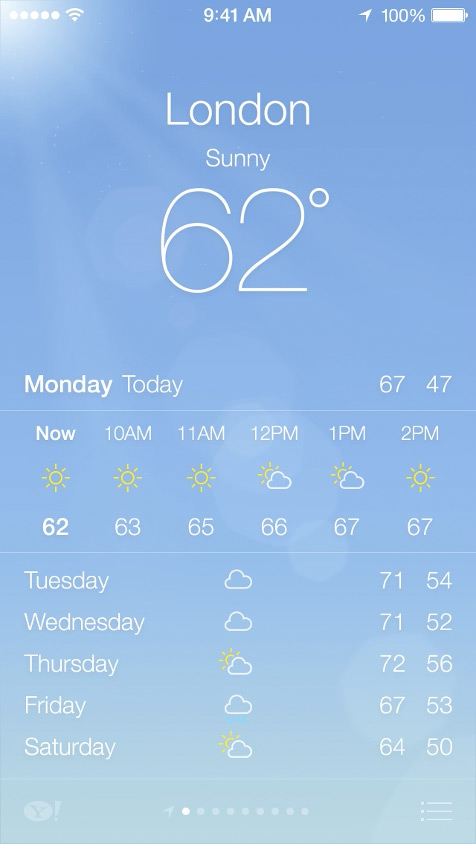
The new iOS 7 mail app looks great! Will it beat gmail?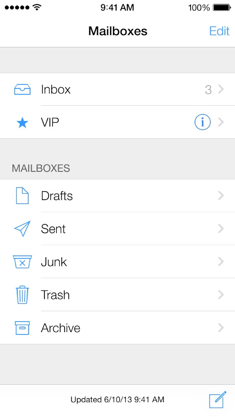
Siri looks more useful than ever in iOS 7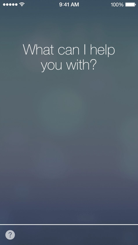
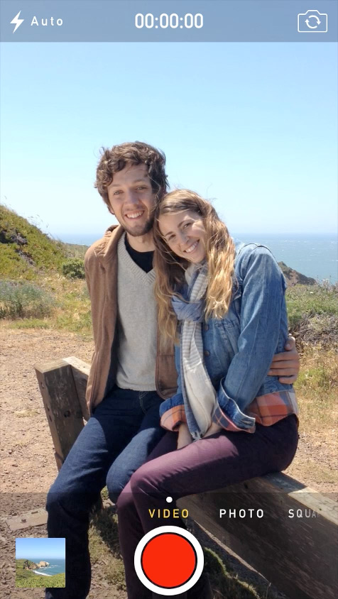
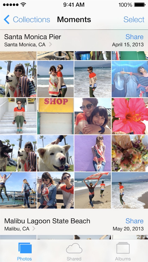
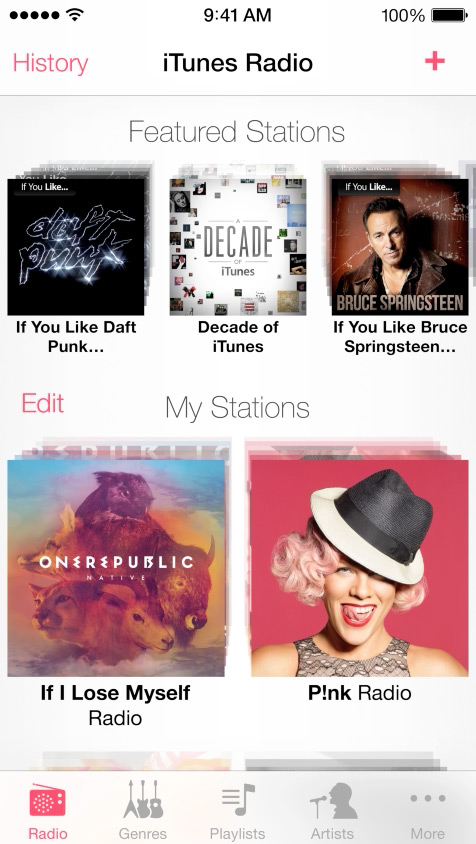
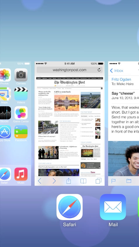
The new multitasking pane shows all the apps you have open, and to close apps you can simply swipe up. This is a beautiful UI gem taken straight from Palm’s WebOS and more recently used by Chrome for iOS.
Want to install iOS 7 on your iPhone 5 or 4S? Read this quick guide.
By <a href=”https://plus.google.com/116162036529120103602?rel=author”>Brian Roizen</a>


From what I see , they’ve stripped everything of any character and personalisatoon !! I won’t be in any hurry to update to iOS7 ~ they seem to be just ‘tinkering’ for the sake of change, lacking any innovative ideas or great improvements !
Brian, I see you are very excited about this update. I think they have stolen idea from windows 8 metro style. what do you think?
I like iOS 7 better than 6, but I definitely agree that Apple took design cues from Windows 8 and Android.
I would really like to see what’s inside the Control Center section of the settings menu. Can u post a screenshot of that? Can u put Newsstand in a folder?
I love iOS7
I love how its taken a HUGE inspiration from android *cough* *cough* HALO THEME *cough*
Props to Apple for designing based on how users behave. Arguably, flat design was brought to the plebians by Windows 8 but W8 architecture is known to be nonintuitive. Among other experience issues. Apple’s strength is delight. The delight of shrewdly giving us what we want either before we know it or can really put words to it. Bravo, can’t wait to play with it.
Nice to see Apple finally catching up with the rest of the Tech world with their visual design. Now I guess we can expect to finally get MacBook Pro’s with touch screens early 2016.
I have been evaluating iOS7 on my iPhone 5 for the past couple of days. Being honest I fell a bit tepid about the whole experience. After years of design innovation why have Apple made the decision to produce their OS seem like a poor cousin of Microsoft’s Windows 8. On the other hand it seems to have borrowed heavily from Android. You can now swipe up to turn on/off WIFI, blue tooth, very similar to Android.In conclusion I like: Newsstand, the inbuilt torch, screen transition, new compass user interface and mail interface.
I don’t like: no mass erase function inside the mail application, it’s still message by message deletion. The pseudo windows interface and menu movement. The settings menu is a bit of a waste land of white space. Just like an aging married couple I am finding more faults with it as time goes on but I grow to love it the more time I devote to it.
Siri looks even more useful than before?!?
How do you arrive at that conclusion?
Ugh! Glad I saw this. I will not be adopting IOS 7 until I am forced too. It’s butt ugly and a real step back. What were they thinking? I’ve only just gotten my wife comfortable on an iPhone and I am not about to start over teaching her a new interface.